
WARNING - This site is for adults only!
This web site contains sexually explicit material:
Hi everyone,
I wanted to give you an early look at the next version of Eurocoeds. The redesign is moving toward a clean, editorial style, with cream backgrounds, burgundy accents and serif headings that give the collection more room to stand out.
The preview brings together a refreshed wordmark, framed collection cards and a clearer arrangement of navigation. On larger screens, the design gives a featured collection more space; on phones, it moves toward a compact layout with larger menu targets.
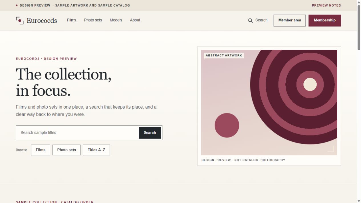
Eurocoeds redesign — work in progress. Sample artwork and sample catalog; final appearance and features may change.
Some of the design details we're developing:
The image shows the reviewed design with sample artwork and a sample catalog. It is a work in progress, so the appearance and features may change before the new version is ready.
Thanks for spending time here and for following along. I'm looking forward to sharing the next stage of Eurocoeds with members and visitors.
Jim


